Showing posts with label Personal Branding. Show all posts

Wednesday, 14 September 2011

My website

After spending some time drawing out and calculating sizes I decided to just make a start as I am bound to encounter some issues as this is only the second website I have made. I have a relatively clear idea of the aesthetic for my site.


Need to make negative space transparent :

too stupid to work out how to do that so pantone matched the space instead. An okay solution for now but would be useful to work out how to do this in future....
roll over button : logo colours change around


creating buttons - for now I am going to use georgia in order to keep it simple.  I realize that a sans serif font might be more readable on screen, but I am going to address this later on when I have more of the structural elements done. I think on this scale (the buttons that is), this font works, but I will make a decision when I have added some body text to the other pages.


rollover orange :

buttons made smaller looks better
original idea for image buttons doesnt work at all - type too small in any font really.

without type :

roll over : image bounces out slightly larger to cover white box to enable use to highlight each project.


I think that in order to fit so much information (all my projects) onto one home page, cropping them down is the only way to display them that works. Also, I think that it creates an interesting gallery effect. I like how it is ambiguous as it might intrigue the user to go further and click on each of them to explore what they are...


rollover :
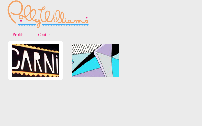


overall effect is built up :


Live preview :


Tuesday, 13 September 2011

Personal logo

I have been experimenting with how I could vary my logo, considering particularly my role over buttons on my personal website.


I think that these patterns when considered carefully can work, but I think that in order for my logo to compliment my own work on my website I think it would be beneficial to tone down the pattern. I think that the logo rolling over as the same colours only in different positions could be as effective as I want but not too intrusive. I have chosen these particular three colours as I feel that they pick up colours that I have used in my other design work exhibited on the site.


Tuesday, 9 August 2011

Personal Branding

I have been meaning to redo my branding for a while so I think this summer is the perfect opportunity for me to do this. I really don't want to get out of practice especially with the software and so far I have not had a lot of time to spend with my computer! I have spent some time looking at new fonts - I particularly like this one, "Masana". I like the freestyle element to it, but also the control and the composition of the letters. The size difference between upper and lower case is quite dramatic, but I think this contrast works well creating an interesting composition. I have chosen to base my new self branding on this type face as I feel that the style and aesthetic suits my design personality. My work and usual choice of subject matter is mainly playful and decorative, like this typeface. 

I did some sketches to kind of redesign the letters roughly in the way that I wanted them :

<images of sketches>

I then used these and the original font to start vector drawing my redesigned version.


I actually did a lot of it free hand rather than tracing through the layers.


This dot below the "o" is an alteration that I came up with. I think that raising the "o" creates a more interesting composition, and the dot adds some decoration to the negative space.


I decided to play around with a variety of different shapes.....
With dots :

With dot and triangle :

With triangles :

With crowns :

Further experimentation :


I'm happy with the progress so far but its not quite there. Obviously colour choices will need to be explored. I am currently developing my website designs and having this branding a little bit more complete will help me with the website aesthetic and layout decisions.

Monday, 27 June 2011

Branding

I've been starting to think more closely about specifically what my direction will be next year. I have found that my natural direction has headed away from more image/illustration driven work to illustrated type and branding. I think that this is how I have learnt to apply my image making skills to a more heavily graphic design context. I want to re-do my personal branding this Summer as well as research into some brands that I find inspiring.

Here are a few that I have found as a starting point with my personal thoughts : 

LIKE :
Monochromatic colour choice
Simplistic 'matter of fact' concept
Use of repetitive pattern.


LOVE :
Colour pallette
typography/brand identity
simplicity
high end/luxury packaging


LIKE :
Logo/brand
variety of pattern linked to brand by colour palette and similar aesthetic


LIKE :
simple colours - but a little too simple for my taste - less intersting than the others.
Logo


LOVE :
inventive /interesting packaging
simple but works
Lovely logo
negative space works perfectly to create interesting aesthetic - less is more


LIKE :
stock choices
use of one bright colour
interesting range of packaging

LIKE:
neg space creates image of class and sophistication
nice logo - stamped effect creates an interesting hands on aesthetic.