
After spending some time drawing out and calculating sizes I decided to just make a start as I am bound to encounter some issues as this is only the second website I have made. I have a relatively clear idea of the aesthetic for my site.


Need to make negative space transparent :

too stupid to work out how to do that so pantone matched the space instead. An okay solution for now but would be useful to work out how to do this in future....

roll over button : logo colours change around


creating buttons - for now I am going to use georgia in order to keep it simple. I realize that a sans serif font might be more readable on screen, but I am going to address this later on when I have more of the structural elements done. I think on this scale (the buttons that is), this font works, but I will make a decision when I have added some body text to the other pages.


rollover orange :

buttons made smaller looks better
original idea for image buttons doesnt work at all - type too small in any font really.

without type :

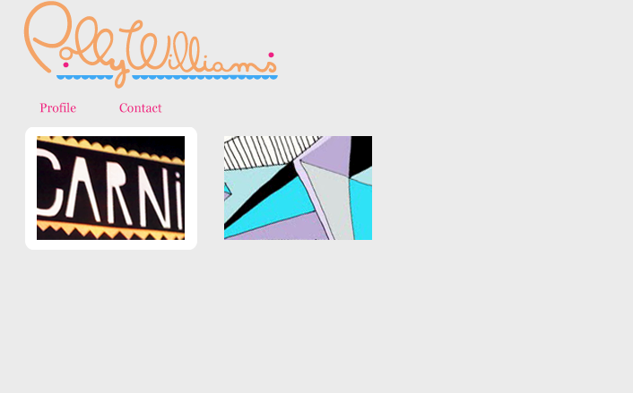
roll over : image bounces out slightly larger to cover white box to enable use to highlight each project.

I think that in order to fit so much information (all my projects) onto one home page, cropping them down is the only way to display them that works. Also, I think that it creates an interesting gallery effect. I like how it is ambiguous as it might intrigue the user to go further and click on each of them to explore what they are...


rollover :


overall effect is built up :

Live preview :

No comments:
Post a Comment