The site is an arts cinema space and basket ball courts underneath the Westway just near Ladbroke grove in west London. Sophie - who I am doing the work for is in charge of all the aesthetics for the event. As the space is white at the moment she has got in a selection of graffiti and graphic artists, including Sweet Toof who is one of the biggest at the moment. She was pleased with my mask designs and said that there was a possibility that she would like me to do a piece on the walls. I sent her my blog address so she could have a look at my work. She particularly liked my typographic designs and said that her boss was keen to have the words carnival 2011 somewhere prominent. However this would have to be done fairly last minute - the day before - as I had to wait to see what materials would be left once the final artist had finished his piece. This element of improvisation both thrilled and terrified me; I desperately wanted to be involved and have the opportunity to showcase my work, but not having the time or facilities to create something that I am really confident with (and pleased with) worried me slightly.
Day 1 :
For the first day I painted table tops, the bars and the cast hands which were all part of the overall design for the event. The idea for the aesthetic was 'put your hands up' and Sophie had chosen a set palette of around 5 colours so that all the work fitted together in some way.
My masks when they arrived...
Some of the artists decided to use me as a human canvas...
There were four mask designs in total, two of mine and the other two by an artist and a graffiti artist.
Day 2 :
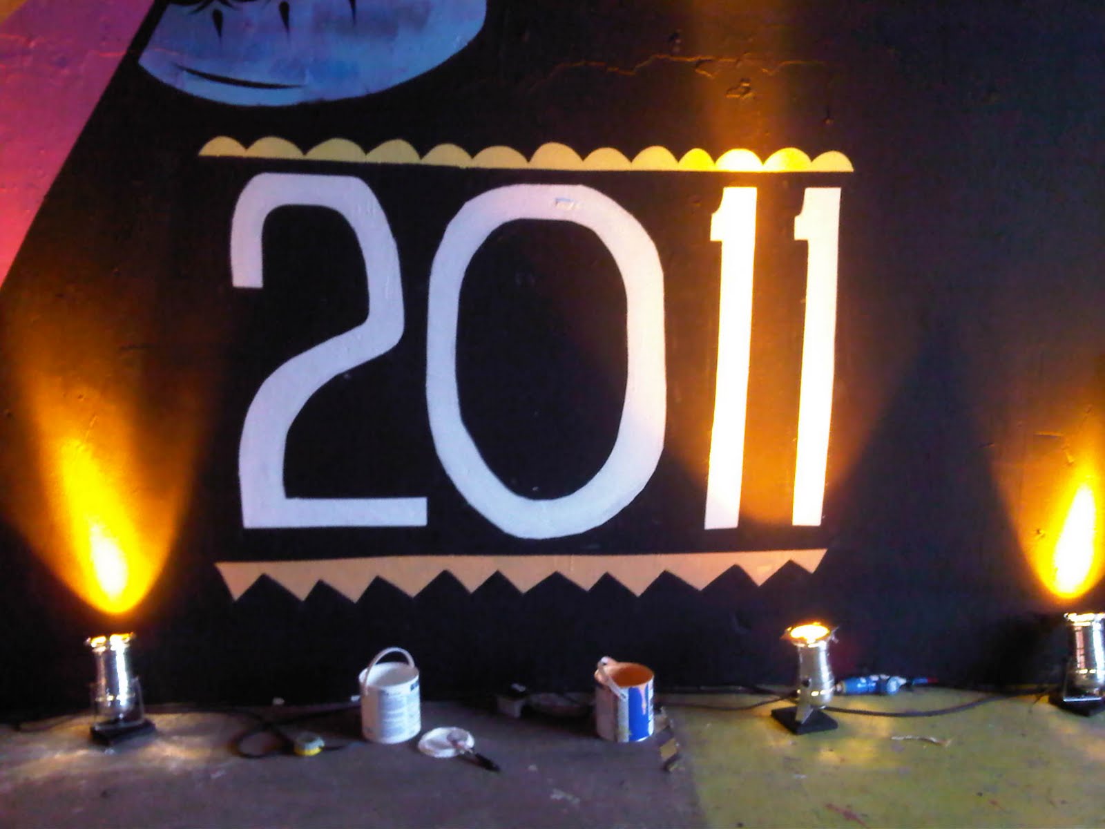
Working 7 foot up in the air did freak me out and working around the scaffolding was a lot more laborious than I imagined, but I got used to it. When my time came I decided to go with something relatively simple, but with the right aesthetic to suit the space. Where they wanted the writing was directly above a huge collaborative piece by sweet toof and another artist, as well as the huge scull piece by a graphic artist filling the rest of the wall to the right. The three artists styles are all rather different which made me want to keep it simple in terms of detail. As I was working directly onto black (time restrictions meant that waiting for a base coat in another colour could be pushing it), I decided to work with a kind of cut out aesthetic. Without time to make stencils I decided to mask out most of my design ("design" being a glamorous name for a fairly incomprehensible sketch that took me all of 30seconds to produce!) - this is so that I could achieve crisp lines. I felt okay doing some of the design free hand, but due to the time restrictions, I felt that I would rather spend time masking out to get it perfect, rather than relying on my potentially inconsistent freehand skills (particularly under pressure) and making mistakes that I'd have to cover up and go over. I hand painted rather than sprayed and then went around loose edges with black posca pen.


view from the entrance to the other room....
I was working on this right up until darkness the night before but it was satisfying and I was so pleased to have something of mine on the wall. Its not my proudest piece, but considering the restrictions I feel I worked to the best of my ability and the organizers were really pleased with it. I feel that I would have been able to create something a bit more interesting and creative had I had the preparation time and now that I have experienced the technicalities of working up on ladders and across vast spaces. Just as a graphic designer would consider different elements when designing for screen or print, I have learnt that this is the same when designing for 'wall'. You have to design with these considerations very much in mind! It is incredible watching some of the graffiti artists that run up and down the ladders at huge speed, while others spent days laboring over a complicated design with brushes, stencils, cans and pen.